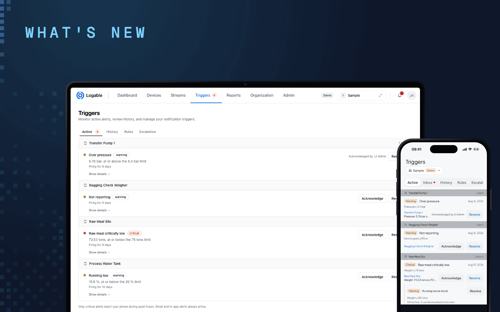
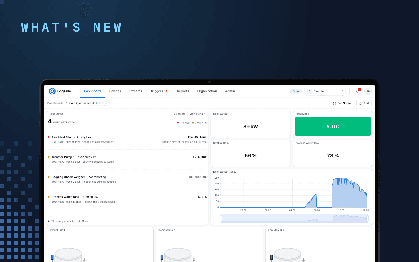
We rebuilt the look and feel of the Logable mobile app, screen by screen. Nothing moved to a new place and nothing needs to be relearned. Screens are cleaner, status is easier to read at a glance, and the heavy pages are faster. The short version:
A cleaner design, built from one set of parts#
Every screen now uses the same building blocks: white canvas, bordered cards, and one rule for buttons. The main action on a screen is a filled, brand-coloured button. Everything else is an outline. That sounds small, but it means your eye finds the right button the same way on every screen.
Settings got the same treatment. Sections have headings, related options sit together, and the quiet hours times now use your phone's own time picker, in your own 12 or 24 hour format.
Status colours now match the web, exactly#
The colours that tell you how a device is doing are now shared between the web app and the phone app, down to the exact values, in both light and dark mode. Running is the same green everywhere. A warning is the same amber. A critical state is the same red. Offline is the same grey.
If you walk from the control room screen to the yard with your phone, the story does not change colour on the way.
Faster charts on the Metrics tab#
The Metrics tab was the slowest part of the app, especially on devices with many readings. Three things changed:
- Charts now draw with a GPU renderer. Scrolling and redrawing are smooth, including on older phones.
- The first charts appear immediately and the rest load right after, instead of everything waiting for everything.
- Live readings arrive calmly. Updates are gathered for a moment and drawn together, so a device reporting every second no longer makes the page churn.
Switching the time range also keeps the previous chart on screen until the new data is ready, so the page never blanks while it loads.
Device pages: the tab bar stays with you#
On a device or stream page, the header now scrolls away and the tab bar pins to the top. You can be deep in a long Metrics view and still switch to Triggers with one tap. Dashboards also got steadier: tiles keep a uniform height whether their titles are one line or two, and the page header no longer crowds the connection indicator on long names.
A tidier inbox and clearer alert wording#
Notifications now group by day, with clear separation between items, and the Archived tab shows everything it should. On alert rules, the severity badge sits in a predictable spot on every card, and notices about a rule's behaviour read as plain sentences, so the list stays calm and scannable.
What you need to do#
Update the app from the App Store or Google Play. Everything in this post is included, and all your devices, dashboards and alerts stay exactly as they are.